What better icon to associate with your UK-centric brand than the indigenous … lion?! Strong and proud … make it purple and job done! But wait a minute … what’s that noise? Is that the rumblings of…
For the first time since launch YouTube has changed its logo. The word ‘Tube’ in YouTube has escaped the red ‘tube’ in which it has been encased for the past 12 years. The changes are subtle and…
Maplin have modernised – creating a fresh new look, updating the brand and refitting stores, to focus on the rapidly growing smart-home market. Maplin has always felt a little ... odd. As a regular…
The national carrier of Australia has updated its look with a new typeface and sleeker, simpler logo ready for the launch of the new 787-9 Dreamliner craft. The brand identity has evolved…
That’s right folks, you heard it here first, today is National Cliché Day. To mark this auspicious occasion we’re sharing with you ten of the world’s most clichéd marketing images. You’ll find them…
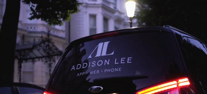
With Uber driving up market share – particularly in the lucrative London B2B market – Addison Lee have launched a new look as part of a £5m marketing campaign. In comparison to Uber, the new…
There’s probably a relationship between periods of austerity being followed by a trend for all things nostalgic. And, there can be no doubt that we’re loving a bit of nostalgia at the moment – from…
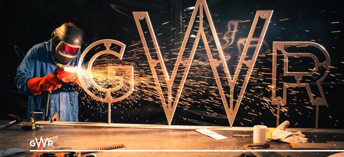
A thoughtfully conceived brand identity should always feel like it fits and this, very literal concept designed by branding agency MultiAdaptor, is a great visual representation of the service…
Clearly, Lexmark had to adapt or die, but their attempt at repositioning provides anything but the ‘focus’ and ‘clarity’ they intended. Did somebody fixate on focus and clarity, manifest it through…


