
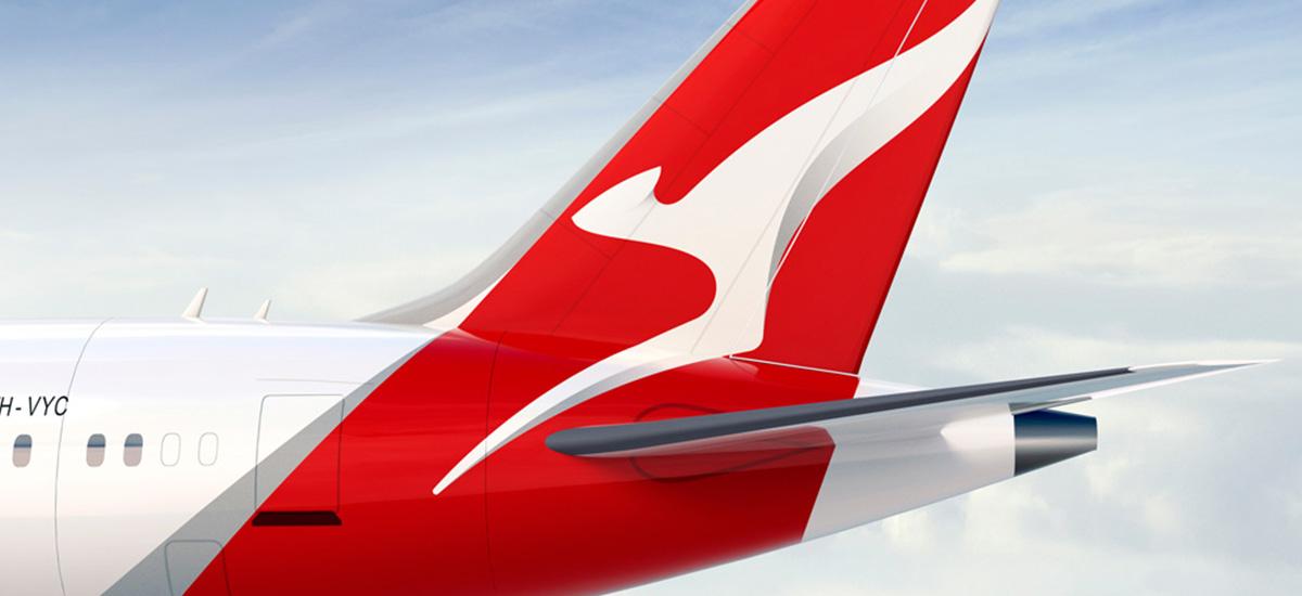
The national carrier of Australia has updated its look with a new typeface and sleeker, simpler logo ready for the launch of the new 787-9 Dreamliner craft. The brand identity has evolved gracefully through the ages, maintaining its name and a strong affinity to its flying kangaroo emblem.
With such a well-established visual identity, Qantas are right not to lose sight of the elements that differentiate their brand from other airlines servicing Australasia. The kangaroo is the unofficial emblem of Australia – since 1944 it has been on the tail of every plane in the Qantas fleet, so they’d be crazy to ditch it!
The new look is a bit edgier, but familiar enough to keep the love and respect of the customer – demonstrating that evolution rather than revolution can sometimes be the best approach when considering a new visual identity.