
Brands are recognising that their support of local manufacturing communicates their commitment to your economy, giving you a warm fuzzy feeling and them a real competitive advantage. This recently…
13 years ago
The updated Twitter logo seems like a natural evolution, a slightly more grown up version of the original logo. This development supports a change in brand guidelines: from now on, we must only use…
14 years ago
In case you missed it, Twitter's logo has been updated (again!). I like the new design, it works much better at very small sizes, but it does mean we need to go over our designs to make sure…
14 years ago
Jaguar's updated logo and typeface will be launched in a brand campaign that aims to engage consumers with the alluring promise to make them 'feel alive'. Sounds like a good strategy... but does…
14 years ago
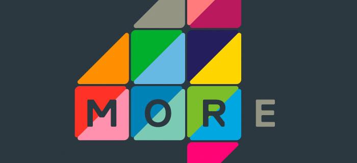
More 4 have rebranded in response to a development in content and strategy. The result is deeply conceptual and suitably vibrant, something a bit different and a successful representation of the…
14 years ago
If Apple is synonymous with impeccable design, Windows are certainly doing a perfect job of differentiating themselves! In this latest development of their brand identity, Windows have created…
14 years ago
We like dots. With the scope to add a dynamic and adaptable element to a brand identity, and as a metaphor for people, dots can be a pretty handy tool within a brand identity. Technology…
14 years ago
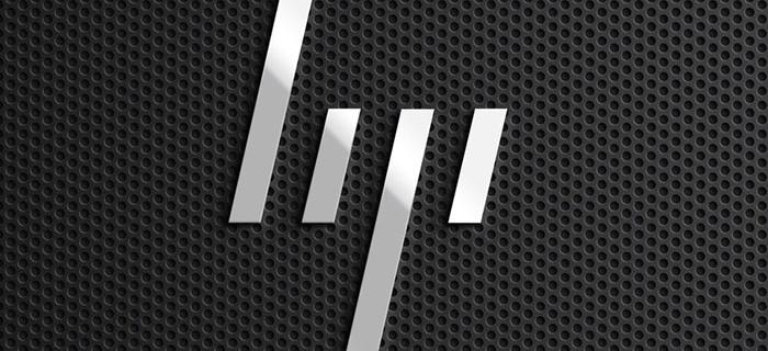
HP - it’s big, but it’s no Apple; perhaps partly due to the brand, which always seemed to lack the necessary sense of pride and excitement to engage its audience and instill loyalty. Ending 2011 on…
14 years ago
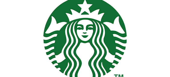
The coffee chain giant kicked-off the year with a brand modernisation that oozed confidence, and created a suitable stir. To mark the 40th anniversary of the brand, Starbucks dropped its logotype…