

A thoughtfully conceived brand identity should always feel like it fits and this, very literal concept designed by branding agency MultiAdaptor, is a great visual representation of the service…

11 years ago
Clearly, Lexmark had to adapt or die, but their attempt at repositioning provides anything but the ‘focus’ and ‘clarity’ they intended. Did somebody fixate on focus and clarity, manifest it through…
12 years ago
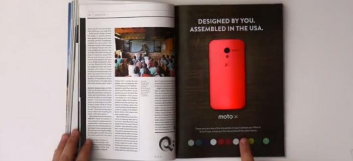
Brands are recognising that their support of local manufacturing communicates their commitment to your economy, giving you a warm fuzzy feeling and them a real competitive advantage. This recently…
12 years ago
After a little brand refresh and the biggest brand endorsement on the planet, Motorola get’s a little more Google-like in their look and their approach. Not only have Motorola integrated some…
13 years ago
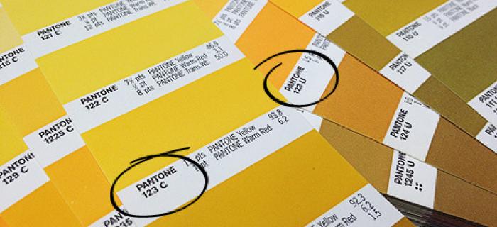
Even when using the Pantone system, colour matching is not an exact science. With this particular shade of yellow, chosen for one of our brand identities (shown above) there are big differences…
13 years ago
We were all for the Eurostar's rebrand, it was conceptual, different, and considered the brand at every touch point with the customer. Or so they said. But, we've recently had experience of…

13 years ago
Progressive approached us having identified an opportunity to fill a gap in the market for a trusted hosted IT solution for oil and gas businesses. As their creative partner, we were excited by the…

13 years ago
Waterstones have embraced digital to enrich the bookshop experience with the strategic, if somewhat surprising decision to stock the products of their main competitor instore. Customers can now try…
13 years ago
In case you missed it, Twitter's logo has been updated (again!). I like the new design, it works much better at very small sizes, but it does mean we need to go over our designs to make sure…