

Recently, Benjy and I decided to get our hands dirty and venture into the world of letterpress printing by joining a workshop being held at Swansea’s National Waterfront Museum. Having spent a good few years ‘setting type’ with Adobe Indesign and Illustrator, we were looking forward to getting a bit of a hands-on education, discovering for ourselves where all of the typography terms we throw about daily came from.
The workshop was being run by the enthusiastic Head of the Museum Steph Mastoris, a self confessed typography boffin, he provided us with a superb ten minute condensed history of print, before letting us loose typesetting with an impressive collection of wood block and metal type.

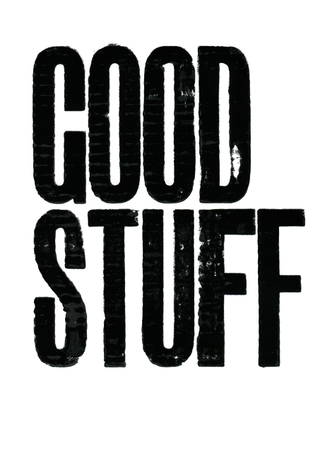
We then got inked up and pressed our prints using the museum’s beautiful working 1830’s Stanhope press. There was something hugely satisfying about slowly peeling back the paper to reveal our creations, the anticipation of whether we had nailed it with a crisp, clean impression, or just made an inky mess on the paper. Unfortunately for a number of reasons our results were closer to the latter. Still, the workshop was a thoroughly enjoyable experience and we’re looking forward to the next opportunity we get to try and master the art. If you are a designer using Adobe Creative Suite or you happen to be a fan of type, we recommend you give it a try.
Oh and just in case you've ever wondered, the terms ‘upper’ and ‘lower’ case originated from the order in which type was laid out in by typesetters in the early days of letterpress. A type case is literally referring to a wooden case within which type is stored ready to be used. Capital letters sat in the upper case, whilst the more commonly used non-capitals sat below them in the lower case within easy reach of the typesetter. Now you know.