
Google are now giving preference to responsive web design when determining how websites should rank in their search results.
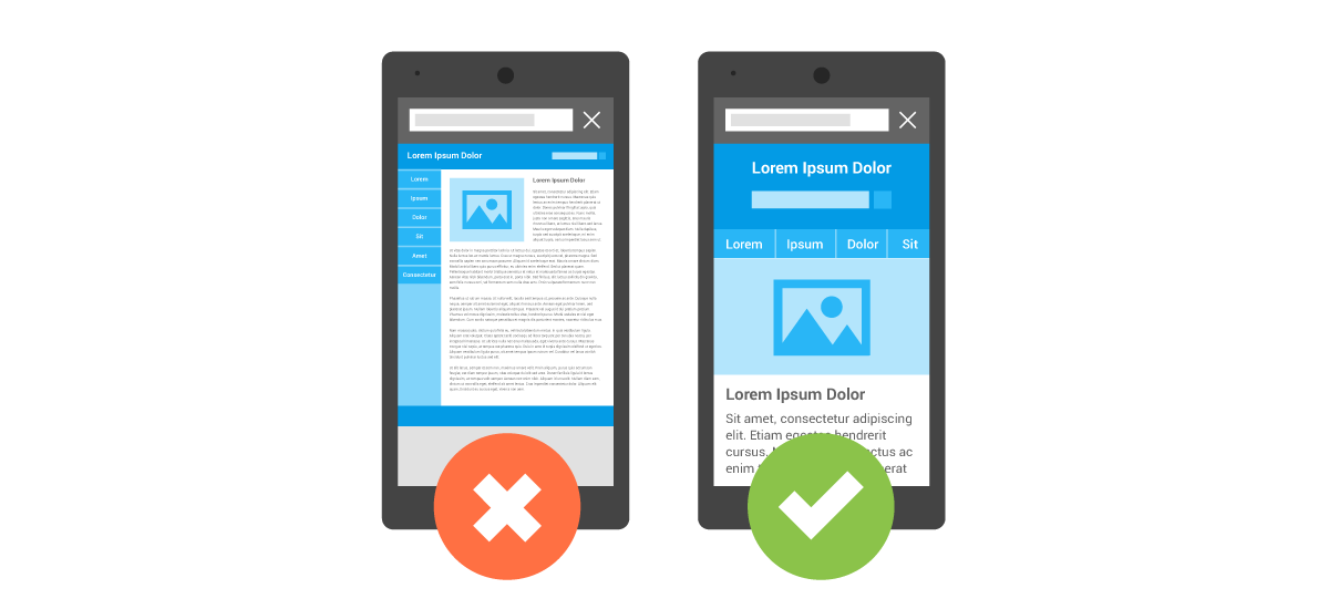
There are many criteria defining ‘mobile-friendly’, but they’re all centred around respecting the users’ experience of your website on mobile (and tablet) devices – text size, navigation, ease of clicking, blocked or unplayable content, dead pages, load speeds, etc etc.
Google have kindly provided a developer tool to test your own website – Google Mobile-Friendly Test. Give it whirl!
If it turns out your website isn’t mobile-friendly, it’s likely that your search rankings could be about to slip. And we’d be only too happy to work with you to ensure that doesn’t happen [plug plug]!