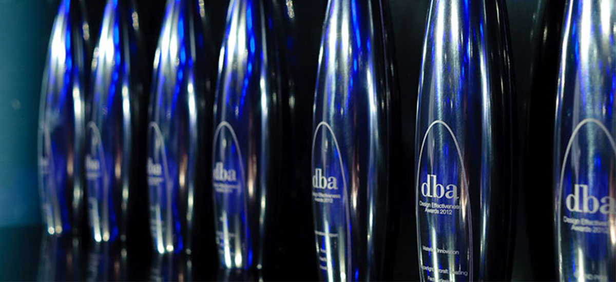
The DBA's Design Effectiveness Awards recognise the return on investment that a coherent, well-thought-out and professionally executed design strategy can achieve.
In our opinion they're the holy grail of design awards... we're hoping to have a shelf full of them!
We admire the Design Business Association's pragmatic approach; they reward the measurable benefits of a project, rather than simply judging on face value. Winning a Design Effectiveness Award involves proving, through in-depth analysis and reporting, that design has yielded a significant return on investment, whether through increased sales, awareness or any other positive and measurable commercial impact.
We've already made a start on our first ever entry for 2013, working with one of our clients to compile and analyse sales data, and the figures look good. We hope we're on our way to winning one of the most coveted awards in the design industry.
As we begin to think about writing our entry for 2013, we've been reading through this year's winners with interest (and a little bit of envy).
Here are our top picks from this year's recently announced well-deserving winners:
James - Be Brilliant Together

Category: Internal Communications
Award: Bronze Design Effectiveness Award 2012
Client: Logica
Agency: The Team
Employee acceptance is important to the success of any corporate rebrand; involvement and communication throughout the process promotes a sense of ownership, creating brand advocates of more engaged employees. Logica reported that 80% of employees were now aware of the brand values, with 72% stating that they understood their role in bringing the brand to life.
It's good to see this important element of the process recognised with a Design Effectiveness Award.
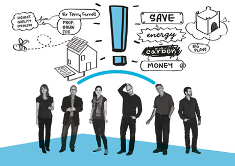
Benjy - Ecobuild Your Future
Category: Museums, Galleries, Events & Visitor Attractions
Award: Bronze Design Effectiveness Award 2012
Client: International Business Events
Agency: Bostock & Pollitt
I'm a bit of tree hugger at heart, so unsurprisingly I was drawn to Bostock and Pollitt's 'Ecobuild Your Future' event campaign. On closer inspection though, it was the mix of hand-drawn graphics with simple colour and type that really sold it to me. The informal style really brought the message to life and helped a potentially dry subject from falling flat.
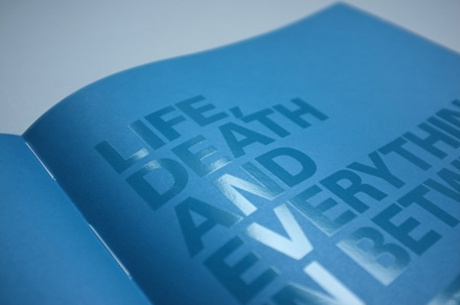
Tori - Legal & General Brand Is Everything
Category: Corporate / Brand Identity
Award: Gold Design Effectiveness Award 2012 & Grand Prix
Client: Legal & General
Agency: Smith & Milton
The Legal & General project is an excellent demonstration that a brand is so much more than a logo. The fact that Legal & General have invested so much in their employee engagement campaign shows that they're committed to delivering on their refocussed brand promise. Putting the brand at the heart of the business has paid off, with an increase of 24% in brand value.
Andy - Cawston Press
Category: Corporate / Brand Identity
Award: Silver Design Effectiveness Award 2012
Client: Cawston Press
Agency: Pearl Fisher
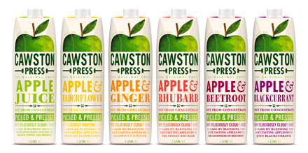
Pearlfisher injected some typographic goodness into juice brand Cawston Press with a rather nicely packaged design, ensuring the product stands out amongst the generic supermarket juices, and stands up to the likes of Innocent on the shelves. According to reports, sales figures rose by 249% in the 12 months post rebrand. I think that's a job well done.
Ed - No. 3 London Dry Gin
Category: Packaging
Award: Silver Design Effectiveness Award 2012
Client: Berry Bros & Rudd
Agency: Brandhouse
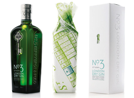
My favourite is the No. 3 Dry London Gin. Its green bottle is instantly recognisable on the shelf, and the bottle's smart modern design and antique looking key imprint make it look stylish and sophisticated.
Kathy - 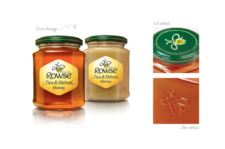
Category: Packaging
Award: Bronze Design Effectiveness Award 2012
Client: Wellness Foods
Agency: Brand Opus
I noticed Rowse's new packaging as soon as it hit the shelves. Competition in the honey market is high with a large number of brands occupying supermarket shelves. This rebrand is a good example of the importance of simplistic design; the design and packaging have been stripped right back and the shape of the jar has been changed to a recognisable hexagonal beehive.
Want to take advantage of our ambition and become the client behind one of these awards? Better get in touch!

