

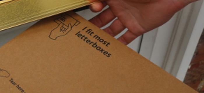
A thoughtfully conceived brand identity should always feel like it fits and this, very literal concept designed by branding agency MultiAdaptor, is a great visual representation of the service…

10 years ago
Over the years, we’ve been fairly critical of companies that have failed to move with the times and adapt to changing conditions. Not the case here! Yale, a brand we’ve all known since the dawn of…

11 years ago
Clearly, Lexmark had to adapt or die, but their attempt at repositioning provides anything but the ‘focus’ and ‘clarity’ they intended. Did somebody fixate on focus and clarity, manifest it through…

11 years ago
Honda pushes the boundaries yet again, and this time brought us along for the ride – testing the boundaries of human cognition with its latest ad, Keep Up. But we think Honda has pushed…
11 years ago
One of our favourite winners in this year’s dba Design Effectiveness Awards is BT’s redesigned router box ‘Hub 5’. Instead of needing a courier, Hub 5 can go by post, cutting the obvious expense, the…
12 years ago
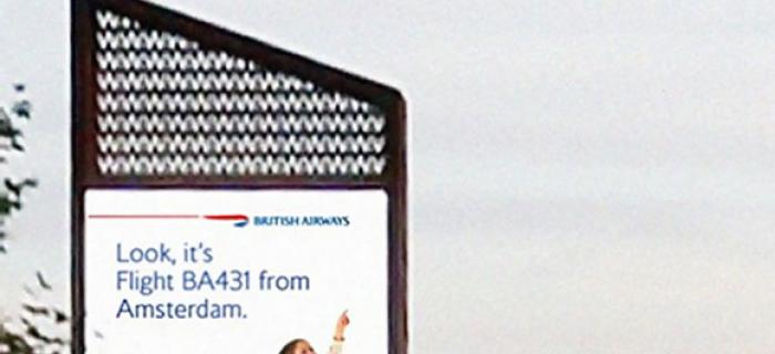
A child points to a BA plane as it passes overhead and the digital billboard changes to display the actual flight number, the destination and a little marketing message – reminding us of the ‘Magic…
12 years ago
Brands are recognising that their support of local manufacturing communicates their commitment to your economy, giving you a warm fuzzy feeling and them a real competitive advantage. This recently…
12 years ago
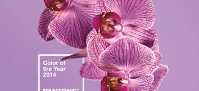
Here we go again… Pantone’s self-fulfilling-prophecy (Colour of 2014) is… Radiant Orchid! Pantone predict these colours so that manufacturers and retailers can plan their stock well in advance and…
13 years ago
We were all for the Eurostar's rebrand, it was conceptual, different, and considered the brand at every touch point with the customer. Or so they said. But, we've recently had experience of…