
Solution
All of our design projects begin with brainstorming and sketching, some projects progress out of the sketchbook faster than others! Our designers worked exceptionally hard to avoid falling into the trap of drawing upon the obvious and over-used imagery of arrows to signify progress.
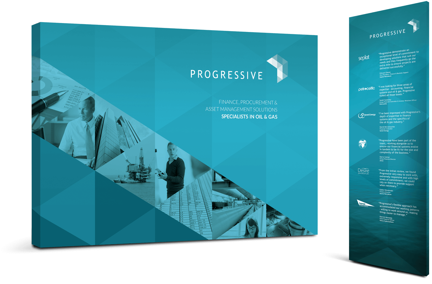
Progressive’s services are all related to financial systems, financial controls and process optimisation – but how to represent this in a visually pleasing and dynamic way? We came up with this stylish geometric pattern, that as well as being a literal representation of mathematics, suggests motion, forward momentum… progression. The pattern lends itself well to use across Progressive’s communications, making consistency and a unified brand identity easy to achieve. The pattern was inspired by the logomark, which works well as a stand alone entity, a mark of understated confidence and professionalism.
When it came to typeface selection usability was key. We wanted something simple, that, like the rest of the design, would suggest understated class, but we also wanted to avoid being different for the sake of being different. The typeface we selected is perfectly fit for purpose. ‘Progressive’ is a long word, and needs to look balanced when applied to all of the company’s communications, from website to letterhead. We opted for a very simple openly spaced type, making a balanced look easy.
Having toyed with the idea of a monotone identity, in the end we decided to apply colour – the soft blue‑green we selected (after staring into a flame, the choice became obvious) not only represents the industry in which Progressive operate, but also hints at the strong feminine influence within the business.
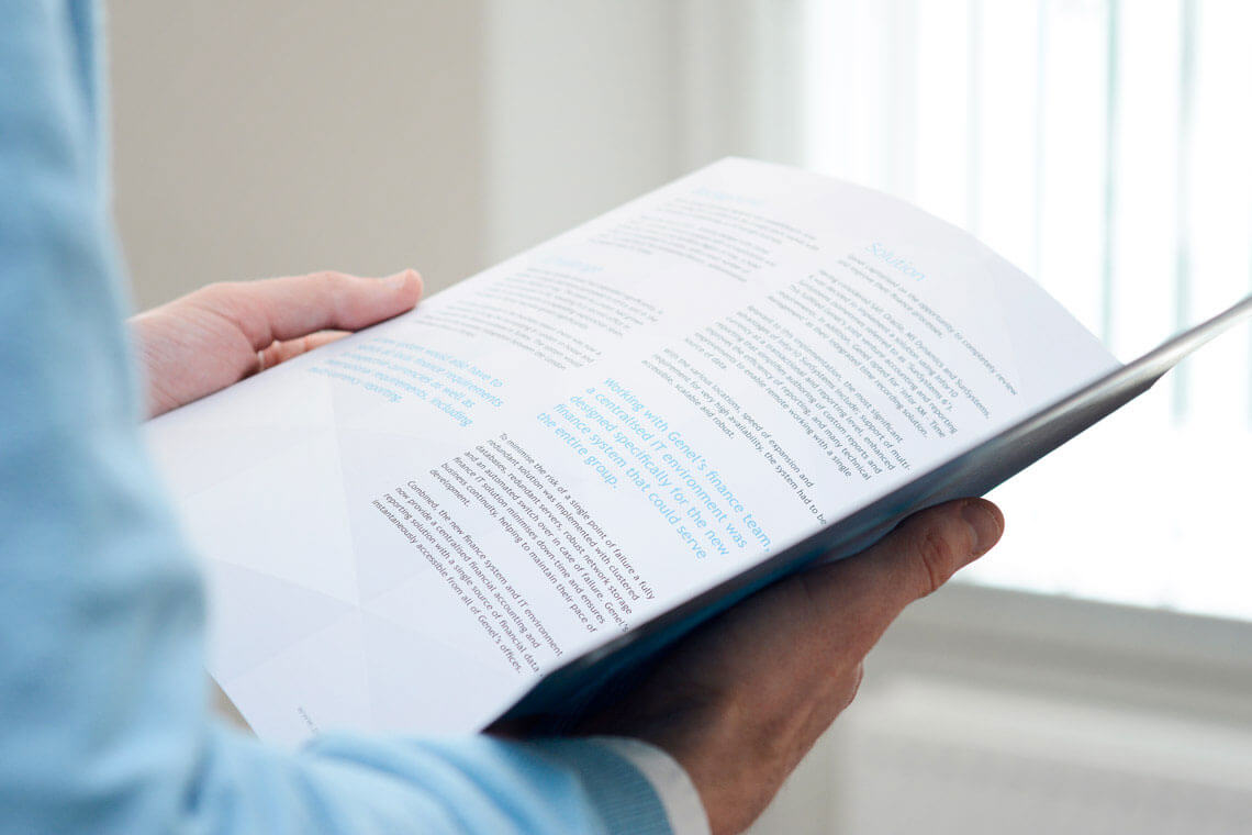
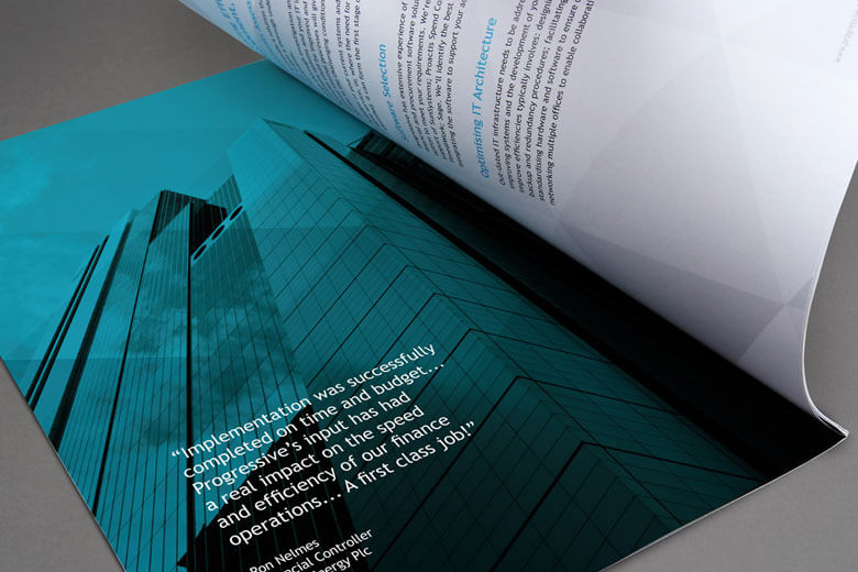
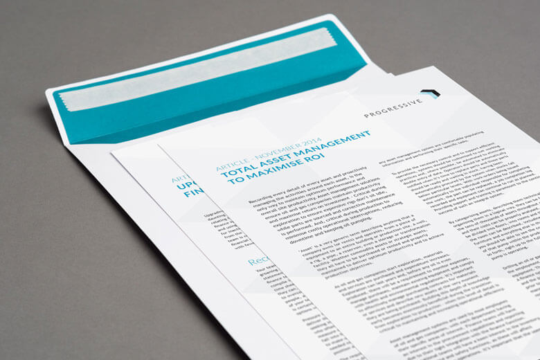
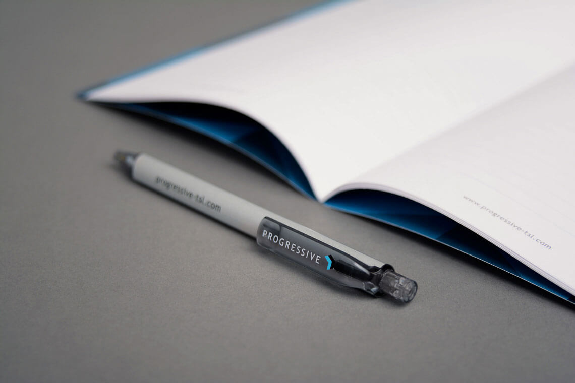
Follow-on work included website, brochures, adverts, case studies and marketing all of which were produced to the highest quality.
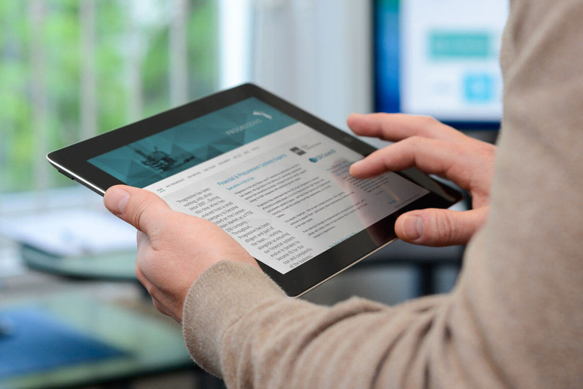
Progressive’s company profile website was launched along with the company’s new brand identity. The website helps to build trust, developing credibility through a professional and corporate look and feel to appeal to executives in the oil and gas industry. It also features a catalogue of industry-related case studies and several pages of text to provide information to prospective clients and assist in the website’s search engine performance.
The pattern used in the background image ties in with the new branding being used consistently across all of Progressive’s on and offline communications.
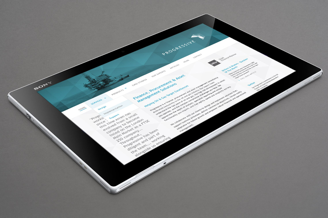
The stylish geometric pattern in the background image is used consistently across all of Progressive’s on and offline communications.