
Solution
It became very clear during a series of research interviews with CMC Partnership’s key staff and associates that the organisation is different from its competitors. Whilst corporate, CMC Partnership is shaped by the lively, happy enthusiastic personalities of the people who really are the building blocks of the business. Unsurprisingly, in addition to their business model, the organisation's success is largely down to the durable relationships formed with new clients and the energy injected into each client’s business.
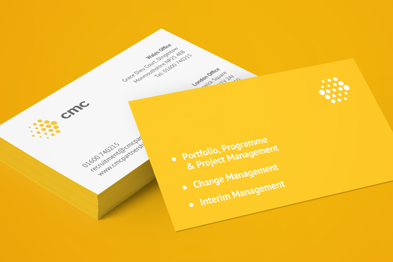
The most effective way to communicate this key point of differentiation was through colour; and standard corporate reds and blues clearly would not do. Our choice of bright, vibrant and happy yellow captures their personality perfectly. It serves another significant purpose in setting CMC Partnership apart from the competition; you won’t miss their stand at a corporate event!

The new identity is also adaptable in the truest sense. The logo can be displayed in various arrangements and forms, and can even be animated to illustrate the principles and methodology used by CMC Partnership staff and associates.
This introduction of motion and direction is a literal representation of the role staff and associates play within client organisations; facilitating change, reordering and rearranging to maximise effectiveness and efficiency. The animated logo also shows how the team change and adapt in order to integrate and work collaboratively with clients, facilitating change from the inside.
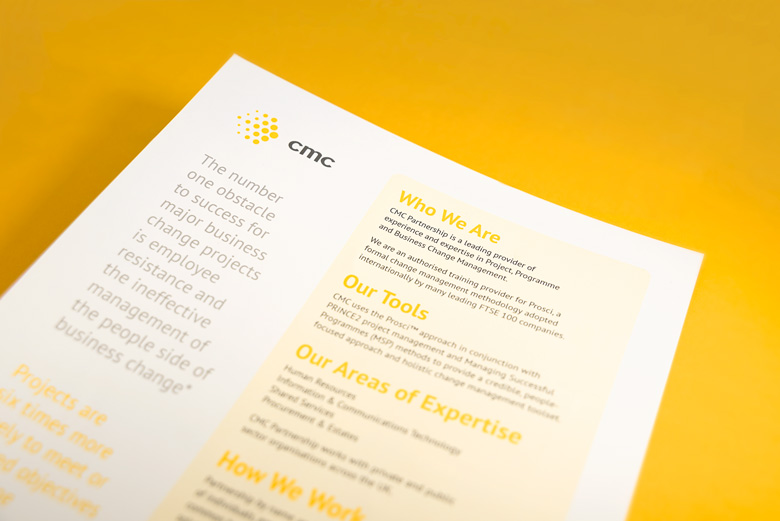
The visual identity extends beyond the new logo, incorporating a strong design style for printed communications; a uniform way of presenting large amounts of printed information in an easily digestible format. We’re introducing the new identity gradually, building recognition and acceptance amongst staff and clients.
Together with a new website, CMC Partnership’s new identity is helping to increase the company’s visibility in the marketplace, especially in the new private sector markets CMC Partnership are targeting, and is making an impact when tendering for new public sector contracts.
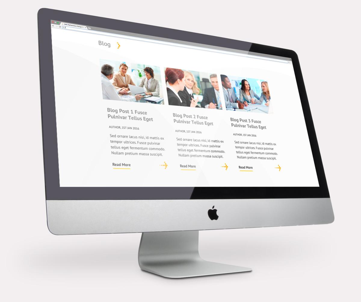
Since the launch of CMC’s brand modernisation in 2011, we’ve been working closely to extend the brand across every communication touch point, producing a full range of printed materials and developing a new website to meet the requirements of the change management consultancy’s public and private sector audiences.
We adopted a phased approach to the development of the website, launching a basic version and gradually adding functionality in order to maintain a seamless user experience.
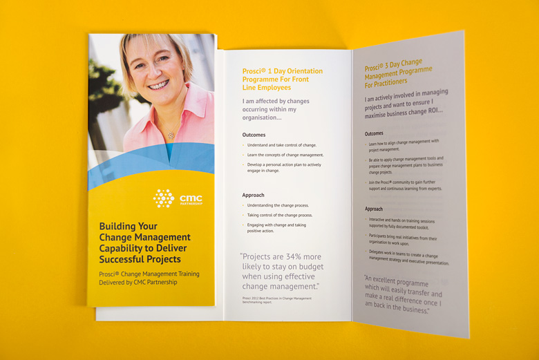
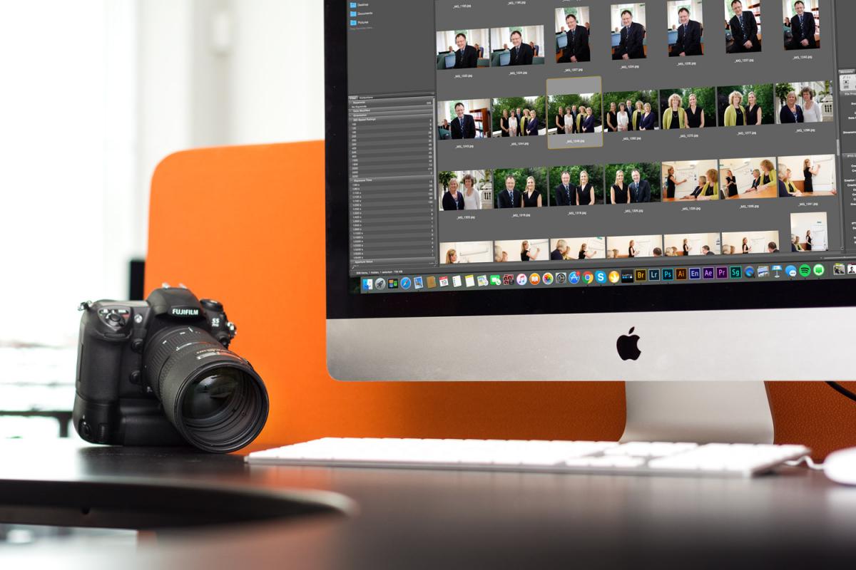
A clearly defined photographic style is another key element of the identity. Stock photos have their place, but for a business that sells itself on the quality of its people, proudly showing those people in communications creates a much more personal impression – the first step towards establishing a real connection with clients.
We’ve defined a photographic style that adds atmosphere and depth to CMC Partnership’s corporate images. Photographs taken at different times and in different locations vary in appearance. Adjusting the style to make each shot look like it belongs to the same family of corporate images ensures consistency across all communications.
CMC Partnership provides open enrolment public Prosci® change management practitioner training, delivered across the UK and Ireland. With an increasing schedule of events, CMC needed an efficient way to manage enquiries originating from website visitors based anywhere in the world.
CMC asked us to create an enquiry management system to help them automate this process. Potential delegates sign up by filling out an online form on CMC’s website, stating delegate numbers, location, date, delegate contact details and a primary point of contact. When an enquiry is made, information is fed into an automatically generated pdf which is emailed direct to CMC.
CMC’s course administrators can manage enquiries through the website, adding or removing delegates and updating course details as necessary.
An automatically updated file containing details of all bookings and the details of attending delegates is available to download from the website.
A secure payment gateway, linked to a full bookings system could be easily integrated into the process, but not wanting to lose out on an early relationship building opportunity, CMC opted to complete the enquiry process manually by picking up the phone, confirming details and taking payment.