Solution
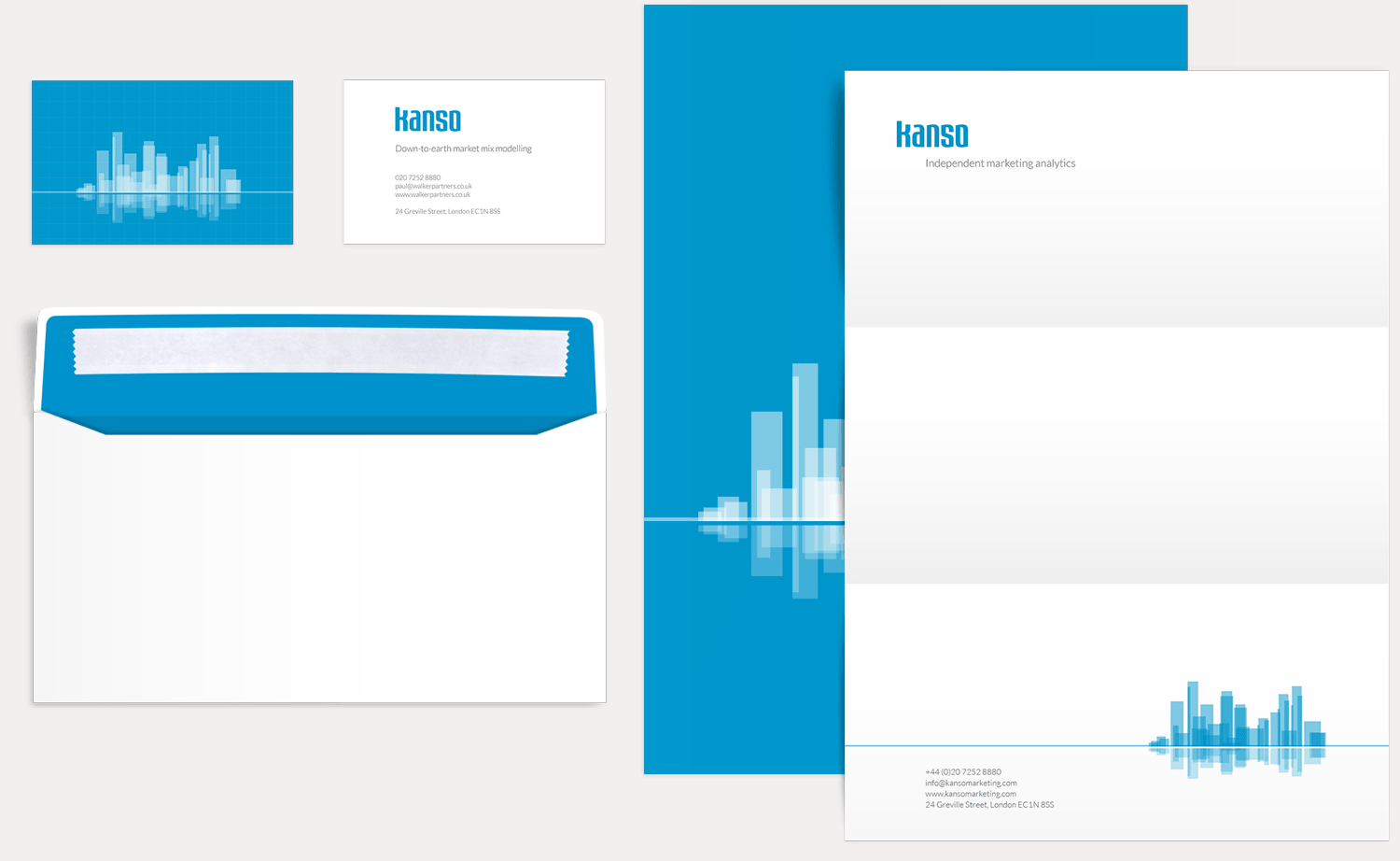
We needed to communicate clarity and simplicity through our design work. It was important for the identity to sit comfortably within the business world, conversely, it needed to stand out as being a bit edgy. The typeface is contemporary but still fit for use within a highly corporate environment. There’s nothing black and white about the work of Kanso Marketing, and dealing with creative folk, an injection of colour was vital. We went through a few colour scheme variations before settling on blue; corporate-friendly, but also synonymous with calm and clarity.

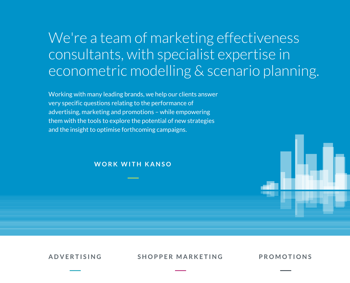
Noticing that bar charts appeared quite frequently within the clients’ presentations, we took this imagery and added relevance by working a cityscape into the design. The final logo mark is an exact replication of the Canary Wharf cityscape. The branding is fit-for-purpose for application across all communication materials, working as well online as it does in print.


Market mix modelling is a little understood area of marketing analysis, and the science behind the process can be off-putting to those who regard it as a kind of ‘dark art’.
Kanso Marketing was keen to alter this perception and differentiate its offering as the straight-talking and down to earth option. This is achieved through concise, honest and plain-speaking copy.
The tone is friendly, befitting of the service provided by Kanso Marketing’s associates, whilst being formal enough to hold its own in the corporate arena. The majority of Kanso Marketing’s competitors go into great detail about the science of econometric modelling; websites typically include several lengthy, and fairly dry, case studies. Recognising that readers are likely to be time poor, the Kanso Marketing website gives confidence in the company’s expertise and clearly presents the benefits of the service, without drowning readers in unnecessary technical details.