Solution
The first essential stage in the design process was to identify Echo’s key points of differentiation and really put our finger on the personality of the business: the following statements resulting from this process would give direction and focus to the development of a brand identity.
Personality: We are proudly confident, focused and aspirational, yet surprisingly down‑to‑earth.
Corporate culture: As providers of a very technical service, we are unashamedly techie, but we also pride ourselves on our appreciation of good business. We are comfortable operating and communicating at any level in either environment, technical or commercial.
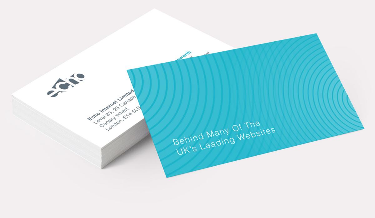
Our conceptualisation and development process culminated in the graphic representation of an echo. The resulting image creates the effect of a reverberation, achieved through the form of a 3D projection of the word Echo. The actual word, whilst being instantly recognisable, is formed of almost nothing. The design causes the viewer to double take – the word is registered instantly but its formation from empty space creates a moment of hesitation – a similar experience to perceiving an echo.

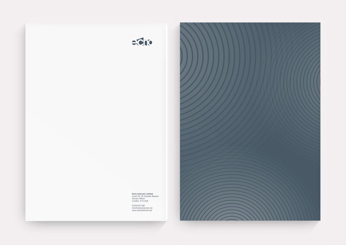
To integrate the concept with Echo’s communication materials we developed a design style using concentric circles to visually represent the action of an echo.
A strong design style ensures that all of Echo’s communications remain consistent, building brand recognition amongst the target audience.