
British Gas are rolling out a recently modernised identity, but it hasn't received the warm response they were hoping for.
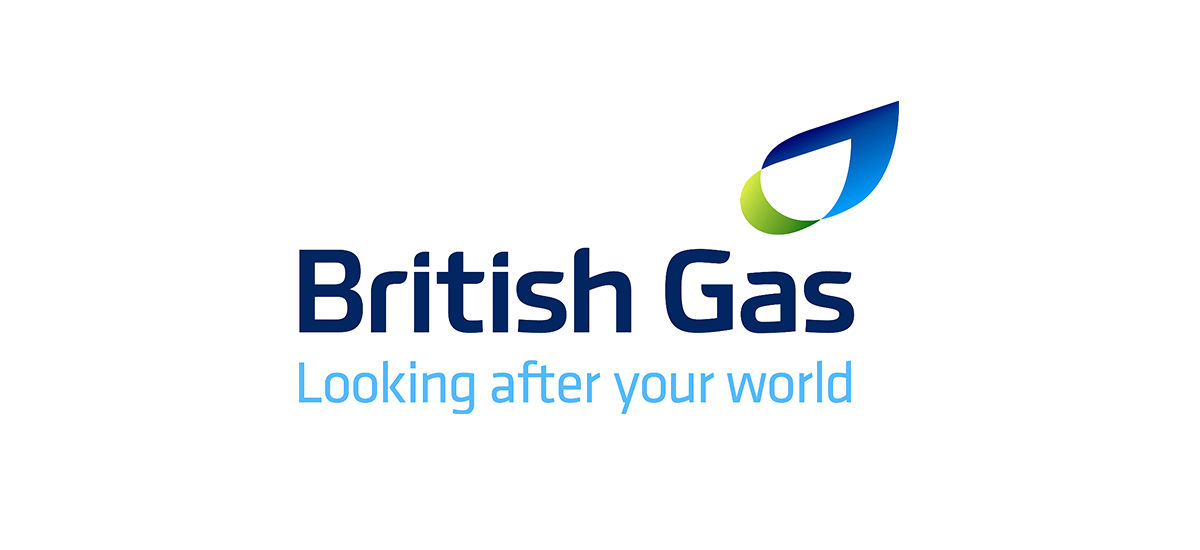
The new logo is a perfect demonstration of typography gone bad! In order to appear unique, unlike the old Helvetica-based type, the new typography has been over-designed, with too much customisation resulting in a feeling of disorder.
The logo mark itself doesn’t feel modern. It feels like an old idea done yet again. The execution is less than perfect too. British Gas’s new vehicle livery lacks impact; it almost looks as if they’re trying to blend into the background.
We agree that the old design needed modernising, but we feel slightly disappointed as British Gas could have invested in what might have been regarded as one of the world’s ultimate rebrands, drawing attention to British design in an international playing field.
Source: Creative Review